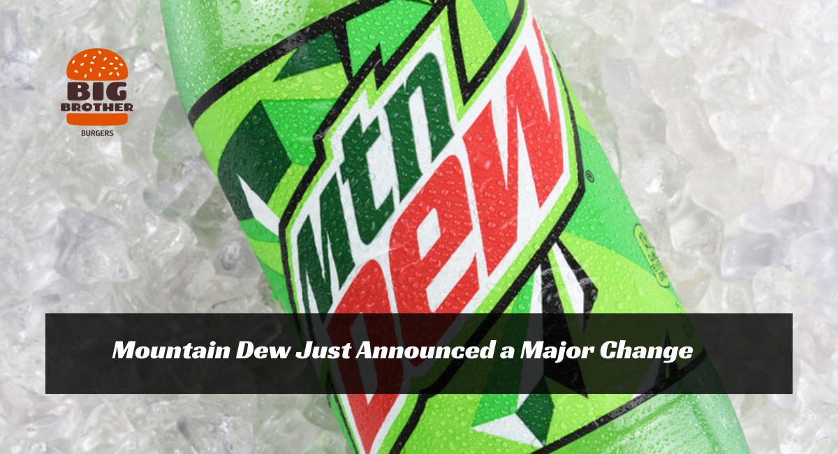
If you’re a die-hard Mountain Dew fan, prepare for exciting changes! The iconic citrus soda, known for its bold, electric lime color and high-energy vibe, is about to transform significantly. This time, it’s not about a new mystery flavor or a limited-edition release for 7-Eleven. Instead, Mountain Dew is tapping into its nostalgic roots, bringing back a vintage-inspired look that will capture its fans’ hearts.
A Vintage Revival: The New Mountain Dew Logo
Mountain Dew recently announced that it is redesigning its logo, and fans of the brand will notice a significant change starting next summer. For the first time in over a decade, the beloved soda will be sporting a new look, ditching its current logo’s sharp, geometric lines in favor of smoother edges and curvier angles. The new design is a nod to the brand’s past, taking inspiration from its vintage logos and incorporating modern elements.
According to reports from Today, the new logo will feature a scenic outdoor backdrop with mountains, a forest, and even a waterfall, paying homage to the brand’s connection to nature and adventure. In addition, the new packaging will return the complete spelling of “Mountain” instead of the abbreviated “MTN” used in recent years.
“Reclaiming the Mountain” with a Fresh Outdoor Focus
Mountain Dew’s new logo and packaging are part of a larger vision to “reclaim the mountain.” This new direction is designed to celebrate the great outdoors and reconnect with the brand’s adventurous spirit. The design team at PepsiCo, Mountain Dew’s parent company, has worked hard to create a look that reflects the soda’s connection to nature while appealing to a new generation of consumers.
The logo’s bright green and yellow hues, combined with scenic mountain imagery, are meant to evoke feelings of freedom, exploration, and the thrill of the great outdoors. This look speaks to the brand’s adventurous origins and gives it a fresh, modern twist.
Extensive Research and Consumer Feedback Shaped the New Look
This significant change took time. According to Today, PepsiCo conducted extensive research with Mountain Dew fans before finalizing the new design. The goal was to make the brand feel more approachable and aligned with Today’s consumers, particularly Generation Z and millennials. The research showed that soda drinkers, especially younger audiences, resonated with the new, more nature-inspired direction.
Mountain Dew’s history is filled with adventurous and high-energy campaigns, but this new look combines that spirit with a deeper connection to nature and outdoor activities. Fans of the soda can expect the new logo to appear on everything from advertisements to packaging by next summer. Early tests have shown that loyal Mountain Dew drinkers have well-received the new design, so it will likely be a hit once it rolls out to the public.
A Look Back: Mountain Dew’s Logo Evolution
Mountain Dew’s logo has gone through several transformations over the years. Initially created in the 1940s, the soda’s branding centered around its roots as a regional, mountain-inspired drink. The early logos were playful and quirky, with illustrations of a cartoon hillbilly and a sense of humor that reflected its Appalachian origins.
As the brand grew in popularity, its logo became sleeker and more modern. The current logo, introduced in 2009, features sharp lines, a bold, angular font, and an overall edgy vibe that aligns with the brand’s “Do the Dew” campaigns, which focus on extreme sports and high-energy activities.
However, as trends have shifted, the brand needs to evolve. The new logo blends the old and the latest with a nostalgic and fresh design.
A Celebration of Mountain Dew’s Vast History
The updated logo is more than just a design change; it celebrates Mountain Dew’s rich history. By incorporating elements of its vintage branding, the new logo reminds fans of the soda’s long-standing connection to adventure and exploration. The scenic mountain backdrop and natural elements also align with the brand’s recent efforts to promote sustainability and environmental responsibility.
Mountain Dew’s outdoor-themed logo is not just about looks—it’s part of a more significant effort to connect with fans on a deeper level. The company has recognized that its audience is increasingly focused on experiences, and the new packaging reflects that shift.
What Fans Can Expect
Mountain Dew fans can expect to see the new logo in stores by the summer of 2024. The updated design will appear on soda cans, bottles, and promotional materials, replacing the current angular logo with its smoother, more nature-inspired counterpart. Fans can also expect to see the whole “Mountain” name spelled out again, returning a sense of familiarity to the brand.
The new design is expected to resonate with long-time Dew drinkers and younger generations who value authenticity and outdoor adventure. With its vibrant colors, natural imagery, and a nod to the brand’s heritage, the new logo is set to make a big splash when it hits shelves.
Conclusion:
Mountain Dew’s logo change marks a significant moment for the brand. By blending its vintage roots with a fresh, nature-inspired design, the soda reclaims its place as a symbol of adventure and the great outdoors. Whether you’re a lifelong fan of the Dew or a newcomer to the brand, the new logo will surely catch your eye and reignite your love for the iconic drink.
So, get ready to “Do the Dew” in a new way next summer when Mountain Dew’s fresh look takes over!
READ MORE: Taco Bell Launching Its Own Spin on a Beloved Chipotle Item

